Friday, May 11, 2007

...My Best Piece...


I call this my best piece because it was created in the Illustaror program and took the most time and detailed considerations. Illustrator is not an easy program to create realistic imagery.

...Illustrator Magic...


This was a experimentation assignment that was to help us get used to the 3D capabilities of the Illustrator program. Here I just created a few recognizable items that I was wondering whether or not the program could depict. It worked.

Thursday, May 10, 2007

...Seagull Logos...


These were an assignment in college that made us portray an image in black and white that is intended to be viewed on a white background. So basically just black. The three Seagulls are my attempt at creating the same subject matter in three different styles. The top is just a bunch of squiggly lines giving the bird a mad or disturbed gesture, the second one is a more traditional clean logo-like style, and the third is a more clip art style rendering. I had fun with this project.

...Now for Illustrator...


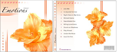
My favorite program to use is Adobe Illustrator. This piece was one of my first production type pieces, this one a CD cover for a compilation CD of various artists and songs. I intended it to be in a 4 or 5 volume set titles "Emotions," each volume adhering to a particular mood that the listener wants to connect with. This one in particular is supposed to appeal to the people angry or depressed about a break up with a boy/girlfriend or mad at love in general. Hay, you all know what I'm talking about. It sounds corny but I was trying to find something that could utilize these flower images and the songs from a particular group I thought fit this mood.

...Fun with Photoshop Brushes...


This piece stemmed from a tutorial on how to create your own brushes in Photoshop. I ended up making this particular brush that I used to create a mythical looking forest growth that I thought looked rather interesting.

...WWII Moment...


This piece is what I consider my best Photoshop piece. This project let us create whatever kind of imagery we wanted with no restrictions. That allowed me to create exactly what I wanted to depict. The amazing thing about this piece is how different the actual images I used are from what you see in the picture. The planes were originally bright chrome airshow planes with a deep blue sky background. I cut them out, changed their color, and added oil and burn marks for a more appropriate scenario.

Wednesday, May 9, 2007

...Photoshop Poster...


This was another assignment in college that had few guidelines. I was still in the jet mode so I created a poster for the Navy jet, F-14 Tomcat. The one Tom Cruise flew in Top Gun. I liked how the filter made the photo a sepia tone so I mimiced that hue in the metalic-like letter in the text. It turned out pretty successful.

...Photoshop Magic...


This picture was one of my first assignments in College using the Adobe Photoshop program. The criteria was to take at least three images and superimpose them into a believable or realistic fashion. The amazing thing is that all of the jet photos I used were the wrong color for the city background. So I had to alter the color and add the heat wave effect to the exhaust to make it more believable. I really like the way the large jet (F-15) turned out.

Ahh...Another Paradise...


This picture was create in Corel Painter. It was such a nice picture I had to include it. I wouldn't call it one of my best because it is so close to the picture I made it from and I don't know a whole lot about Corel. However, the colors are awesome.

Tuesday, May 8, 2007

...Ahh...Paradise...


This is my other colored piece that I am proud of. Another high school project, this time created using oil pastels in a pointillism fashion. The instructor insisted on us using as many colors as possible to create the different shades and hues. Every spot of color was done by tapping the paper with the oil pastel. Initially, I got a little carried away on scale by making it about 36"x24". Luckily it was a semester project but it was definitely time consuming. It sounded like twenty woodpeckers in class while everyone was working on this project. I think only three or four students out of the twenty got anywhere close to being done.

Now For Some Color...


Here is my first successful tempera paint project. The assignment was to zoom in on an object in order to distort the perception of what it actually is. My subject is one of my bracelets, specifically the clasp and a section of the beads. The beads are chrome but the assignment asked for us to paint it monochromatically. Now, I hate painting so this is rare. I only have two color pieces that I have done with my hands. I definitely prefer to use the computer to do my coloring.

The Dog...


This was another high school assignment that consisted of taking a magazine picture, scaling it and drawing it onto a larger piece of paper and dividing it into one inch squres. The squares helped keep things in proportion but the assignment was to draw individual patterns and designs in each square that would define the subject matter appropriately. It took forever and a lot of pencil lead.

A Little Less Formal...


This is an old high school art assignment that was to help draw in proportion. We took a magazine picture, cut it in half, and draw one of the halves. I found Abraham Lincolns picture and drew his face. Its the center section.