Friday, September 11, 2009
Welcome...
Welcome to the online portfolio of Jake Rust. Below are a series of examples of my work from my latest employer to my internship and then my college experiences. To your right are some exaples of my photography. Thanks for visiting and I hope you enjoy.
Illustration artist...
My latest employer, Graphic World, is a production agency for the layout and compostion of various medical, and institutional books and material of which required me to illustrate and design various images for visual reference within the publications. The next few entries highlight my various styles and subject matter required for the position.


Photoshop illustrations...


Some clients that my previous employer worked for asked for more painterly or hand drawn styles of artwork to better suit their publication. These are some that I created.


Human illustrations...

These are human illustrations using Adobe illustrator using same style guidelines as the animal illustrations.
Animal illustrations...


These are some examples of some animal vector art created with Adobe Illustrator.
Monday, March 3, 2008
Internship...
Below are some of the work I have done through my internship with Save-A-Lot food stores in their corporate headquarters.
Thursday, December 6, 2007
...Charity Event Logo...

This was a concept logo developed for the Save-A-Lot annual United Way campaign. It was an option that made the event have more of a New Years feel that they never pursued before.
...Logos...

The top logo was developed for general merchandise consisting of severe weather equipment and emergency tools like flashlights, blankets, batteries, small radios, etc.
The bottom logo was for the card game Go Fish. It was placed on the outside of the packing developed for the pack of cards.
...Blood Drive Event Poster...

This is a poster Save-A-Lot had me create for their yearly blood drive campaign. It is the promotional and sign-up poster for the event.
...Jumbo Chalk...

This is a General Merchandise item of Save-A-Lot that I created for their childrens Jumbo Chalk Bucket. It is a sticker label that is positioned on the side of the bucket.
...Water Packaging...

This is the package design that I developed for the Save-A-Lot Purified Drinking Water. At this point in time, I was not familiar enough with the routing and production side of the project so another designer took over after the design was finalized. It is currently being sold at your local Save-A-Lot store.
...French Toast Sticks...

This is the packaging that I developed for Save-A-Lot's French Toast Sticks product. I was a line extension that followed the design and layout created by another designer for the Waffle and Pancake products. This packaging I was able to take for start to finish including the photoshoot and critiques with the CEO's. It was printed and should be in the stores.
...Sponge Packaging...

Here is a label I have done at Save-A-Lot for two packs of sponges, one with a microfiber wraping and one with a scrubbing side. The sponges are shaped like a fat number eight and the label wraps around the center with space for a bar code.
Commercial Items: Snack Tray

This is a product label that I developed for a General Merchandise product while working for Save-A-Lot food stores. It is a sticker that raps over a stack of three party trays intended to hold the trays together and act as the label for the product. They are party trays shaped like a half of a yin-yang symbol and the label refers to the different configurations possible with the set.
Friday, May 11, 2007
...My Best Piece...

I call this my best piece because it was created in the Illustaror program and took the most time and detailed considerations. Illustrator is not an easy program to create realistic imagery.
...Illustrator Magic...

This was a experimentation assignment that was to help us get used to the 3D capabilities of the Illustrator program. Here I just created a few recognizable items that I was wondering whether or not the program could depict. It worked.
Thursday, May 10, 2007
...Seagull Logos...

These were an assignment in college that made us portray an image in black and white that is intended to be viewed on a white background. So basically just black. The three Seagulls are my attempt at creating the same subject matter in three different styles. The top is just a bunch of squiggly lines giving the bird a mad or disturbed gesture, the second one is a more traditional clean logo-like style, and the third is a more clip art style rendering. I had fun with this project.
...Now for Illustrator...

My favorite program to use is Adobe Illustrator. This piece was one of my first production type pieces, this one a CD cover for a compilation CD of various artists and songs. I intended it to be in a 4 or 5 volume set titles "Emotions," each volume adhering to a particular mood that the listener wants to connect with. This one in particular is supposed to appeal to the people angry or depressed about a break up with a boy/girlfriend or mad at love in general. Hay, you all know what I'm talking about. It sounds corny but I was trying to find something that could utilize these flower images and the songs from a particular group I thought fit this mood.
...Fun with Photoshop Brushes...

This piece stemmed from a tutorial on how to create your own brushes in Photoshop. I ended up making this particular brush that I used to create a mythical looking forest growth that I thought looked rather interesting.
...WWII Moment...

This piece is what I consider my best Photoshop piece. This project let us create whatever kind of imagery we wanted with no restrictions. That allowed me to create exactly what I wanted to depict. The amazing thing about this piece is how different the actual images I used are from what you see in the picture. The planes were originally bright chrome airshow planes with a deep blue sky background. I cut them out, changed their color, and added oil and burn marks for a more appropriate scenario.
Wednesday, May 9, 2007
...Photoshop Poster...

This was another assignment in college that had few guidelines. I was still in the jet mode so I created a poster for the Navy jet, F-14 Tomcat. The one Tom Cruise flew in Top Gun. I liked how the filter made the photo a sepia tone so I mimiced that hue in the metalic-like letter in the text. It turned out pretty successful.
...Photoshop Magic...

This picture was one of my first assignments in College using the Adobe Photoshop program. The criteria was to take at least three images and superimpose them into a believable or realistic fashion. The amazing thing is that all of the jet photos I used were the wrong color for the city background. So I had to alter the color and add the heat wave effect to the exhaust to make it more believable. I really like the way the large jet (F-15) turned out.
Ahh...Another Paradise...

This picture was create in Corel Painter. It was such a nice picture I had to include it. I wouldn't call it one of my best because it is so close to the picture I made it from and I don't know a whole lot about Corel. However, the colors are awesome.
Tuesday, May 8, 2007
...Ahh...Paradise...

This is my other colored piece that I am proud of. Another high school project, this time created using oil pastels in a pointillism fashion. The instructor insisted on us using as many colors as possible to create the different shades and hues. Every spot of color was done by tapping the paper with the oil pastel. Initially, I got a little carried away on scale by making it about 36"x24". Luckily it was a semester project but it was definitely time consuming. It sounded like twenty woodpeckers in class while everyone was working on this project. I think only three or four students out of the twenty got anywhere close to being done.
Now For Some Color...

Here is my first successful tempera paint project. The assignment was to zoom in on an object in order to distort the perception of what it actually is. My subject is one of my bracelets, specifically the clasp and a section of the beads. The beads are chrome but the assignment asked for us to paint it monochromatically. Now, I hate painting so this is rare. I only have two color pieces that I have done with my hands. I definitely prefer to use the computer to do my coloring.
The Dog...

This was another high school assignment that consisted of taking a magazine picture, scaling it and drawing it onto a larger piece of paper and dividing it into one inch squres. The squares helped keep things in proportion but the assignment was to draw individual patterns and designs in each square that would define the subject matter appropriately. It took forever and a lot of pencil lead.
A Little Less Formal...

This is an old high school art assignment that was to help draw in proportion. We took a magazine picture, cut it in half, and draw one of the halves. I found Abraham Lincolns picture and drew his face. Its the center section.
Monday, April 9, 2007
The Final Drawing Assignment...

This drawing was assigned as the final in my drawing II class marking the end of my drawing assignments in college. I continued drawing afterwards on my own time but in a more traditional fashion and of things I want to draw rather than a pile of white blocks, bones, and the outside of the art building at school. However, there were a few assignments done way back in high school that I am still proud of that I will show in the next few posts. Some of them will include some color.
Gestural Piece...

This assignment is based on the same principles as the last two posts. The professor liked the way my class' pieces turned out so she continued assigning it for several class periods. This was the last one.
Monday, April 2, 2007
My Best Figure...

This drawing done in pencil is definitely my best figure drawing in all traditional fashon. Though the figure is not of an actual model it was of a life size reproduction of a Greek or Roman statue. I was anxious to draw something that looked finished and complete like I did in the beginning levels of drawing so I payed special attention when doing this one. I remember trying to find the best angle to view the statue with the best lighting and shadows. This is what turned out.
Thursday, March 22, 2007
Quick Study...

This drawing was done using charcoal with the goal of capturing the depth of the still life. In this case, a plaster sculpture replaced an actual model but our technique was still rushed. The class was only assigned one hour to advance the drawing as far as possible. This sounds like plenty of time, but we had to make a good composition, rendering, and scale for a grade. I resorted to my technique of blending the charcoal with my fingers to quickly give the right shades where they were needed. This was a fun piece for me since it turned out well. Hope you like it.
Wednesday, March 21, 2007
Style Variation...

As figure drawing class became more advanced, my professor decided to let the students try two styles of drawing on one picture. The left side of the drawing is done using a scribbly, gestural style that I thought would contrast the developed and traditional style of the right side. I also thought that the simplified style on the left would show a sort of developmental process that leads to the finished product on the right side. In the end, I admit, it does appear lopsided, but since the figure turned out so well I had to incorporate it into a post.
Thursday, March 15, 2007
...Bone Study...

Bone studies seemed endless in drawing classes but most of the time you don't have the opportunity to complete them. With this one we did have some time but with restrictions. This assignment was set up to test compositional skills which is the hardest part in drawing for me. However, the professor told us to zoom in on a particular area enough to lose the identity of the subject matter. The problem was, if I zoom in too far, there isn't enough information to draw but if I don't zoom in enough, the subject matter is easily recognizable. In this drawing I could have zoomed in more to meet the criteria of the assignment but a cow skull was an unavoidable object. The professor still liked the result and especially the fact that the scull did not appear as the center object or simply a study of a scull but of "an interesting setup of bones." So, with that I continued and developed it to this point in the same manner as the still life drawing of the box frames and studio lights, with the paper acting as the middle gray and me shading the shadows and highlights with black and white conte crayon.
Monday, March 12, 2007
The Underlying Figure...

One of the hardest things to translate to paper is wrinkled paper. Here, a plaster model of a greek statue was wrapped in thick brown paper. The objective was to distinguish the underlying figures depth. We didn't do this assignment but once so this was the result.
Friday, March 9, 2007
Hand Study...

Most of the time in Figure Drawing class we did small studies like this one to test our ability to translate a sense of depth. Here, the placement of the elements on the page was crutial so as not to make them look like they are floating or on a tilted pedestal. I thought the overall composition from my vantage point looking at this still life made for a decent composition. By the way...that seashell was brutal trying to make that look right.
Wednesday, March 7, 2007
...Figure Drawing...

Okay...now it gets interesting. This assignment was composed of two elements. The main element was to focus on a particular area of the figure and draw what we could within two minutes. Then, you have to flip your paper a quarter turn and pick another area of the figure to draw on top of your previous sketch where you think it fits best. Do this three or four times and that element was done. After that, we had to shade it and fill in blank spaces with various shades and blends in a way that defines an implied form of reflected light to complete the composition. This process causes some distortion and sporadic light sources but forms the results you see here. Projects like this seem so ridiculous when the teacher describes them at the beginning of class but it really pushes you to go where you normally wouldn't. So, even though it looks like a pile of body parts...I thought it turned out well compositionally if you can except it for what it is.
Monday, March 5, 2007
My Best Still Life...

Some of the smoothness and the blends in this conte crayon piece were not caught by the picture I took of it so a little information was lost but the idea is still present. This is one of my favorite drawings from college because of the way in which it was done. The paper is a dark gray which is utilized as the middle gray color while I used black conte crayon for the shadows and white for the highlights. I thought this was cool because it was the first time I've ever drawn the highlights of something. It was a little hard to think in those terms. Another reason why it is one of my favorites because I remember how hard it was to get those cube shaped frames to look right as they cast shadows across each other and how they were leaning at weird angles. It took me about two class periods to work out all the details.
Friday, March 2, 2007
How About Some Tradition...


In order to get a fine art degree in college, even for Graphic Design, you have to take a series of traditional art courses including Drawing, Painting, and Sculpture. Now, since I was a kid, I've had a pencil in my hand drawing anything I was interested in, usually jets and cars and car tank hybrid machines that I thought were cool, but as I got older, I started to want to learn how to draw people and other natural subject matter. Though not a fan of college, it did give me the time to learn. In college, I was able to produce some rather nice pieces in charcoal and pencil(graphite). In the next few posts, I will show you some of what I managed to accomplish through my Drawing I, Drawing II, and Figure Drawing classes.
Thursday, March 1, 2007
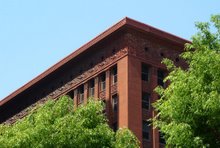
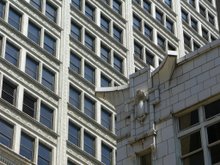
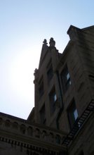
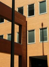
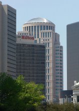
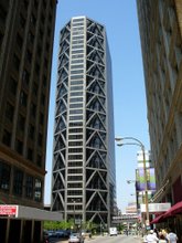
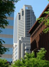
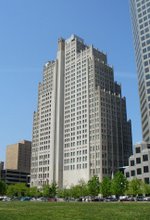
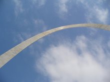
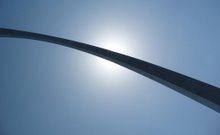
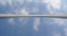
St. Louis Photography
Here are some more photographs that I took while on an architectural tour through St. Louis on the right side of the page. I'll show the rest of the pictures I took then move on to showing some more of my traditional art projects. My Illustrator and Photoshop files still need to be converted to jpegs so I can post them. Hope you enjoy these in the mean time.
Monday, February 26, 2007
Let's Get Started!
I am definitely new to this whole blogging thing but it's time for me to learn. I will have to take baby steps so I hope you will have the patients to deal with the crudeness.
Alright, this blog is intended to be my online portfolio but it will also be my way of communicating my interests. To start off, I would like to show you some of my artwork that I developed in college using Adobe Illustrator and Photoshop. However, to keep things interesting, I am going to show you only one or two items per post to keep you hooked. Hopefully you enjoy and stay tuned.
Alright, this blog is intended to be my online portfolio but it will also be my way of communicating my interests. To start off, I would like to show you some of my artwork that I developed in college using Adobe Illustrator and Photoshop. However, to keep things interesting, I am going to show you only one or two items per post to keep you hooked. Hopefully you enjoy and stay tuned.
Friday, February 9, 2007
Subscribe to:
Posts (Atom)